How long does a project take?
Depends on the package. One-pagers can ship in a week or two. Full-stack builds usually take 3–5 weeks. We don’t drag.
Most of the people we work with didn’t realize how bad their site was hurting them, until it stopped working. We design to solve that. Our builds look sharp, load fast, and guide users straight to action. Because that’s what websites are supposed to do. From wireframes to final build, our process is rooted in performance. We focus on flow, clarity, and conversion, not trends. What you get isn’t just a good-looking site. It’s a tool that helps your business grow, close, and scale.
We don’t design in the dark. We start by locking in goals, target users, brand tone, and the outcomes the site needs to drive. This step gives every design decision a purpose.
Before color or fonts, we lay out how it moves. Wireframes help us define the structure, page hierarchy, content zones, and user flow. This is where usability takes shape and logic starts speaking.
Once the blueprint’s solid, we bring in style. Clean type, purposeful spacing, sharp balance. We don’t decorate, we design with clarity and rhythm that fits your brand without chasing trends.
You’ll see what’s coming and why, no guessing, no endless loops. We refine based on real use, real feedback, and make sure every screen is ready to go the distance across devices.
Designs are shipped dev-ready, structured, organized, and annotated. We can hand it off clean or build it ourselves. Either way, it’s wrapped tight, built to scale, and ready for launch.
Design isn’t just about what users see, it’s how they think, move, and act. We design with strategy first, then style, so your site doesn’t just look clean, it drives decisions. Results? That’s the baseline. We treat web design like infrastructure, not decoration. Every piece is built to support something: conversion, trust, clarity, speed. If it doesn’t do its job, it doesn’t make the cut.
Before the visuals, we map out how users move, where they click, and how they convert. You get a flow that makes sense, no wasted clicks, no dead ends.
We place CTAs where they’ll get hit, not hidden. Every section stacks with purpose, guiding users from curiosity to action without breaking the scroll.
Slow pages kill good ideas. Our builds are designed lean, optimized visuals, no junk layers, and performance baked in from the start.
Menus, links, and page paths are crafted so users don’t think twice. They find what they came for without clicking around in circles.
No page on your site should feel like a stranger. We design systems that make every new screen feel instantly on-brand and on-point.
Our layouts follow hierarchy that search engines and humans love. From headings to content flow, structure is locked, crawlable, and readable.
Pick a package and let’s move. These three builds are locked, loaded, and mapped to real business stages — from one-pager launches to full-stack growth sites. We priced them fair, scoped them tight, and made it easy to choose. No surprise fees, no agency tricks. Just hit the one that fits and we start building.
Pick a package and let’s move. These three builds are locked, loaded, and mapped to real business stages — from one-pager launches to full-stack growth sites. We priced them fair, scoped them tight, and made it easy to choose. No surprise fees, no agency tricks. Just hit the one that fits and we start building.
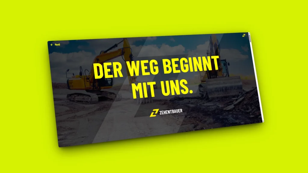
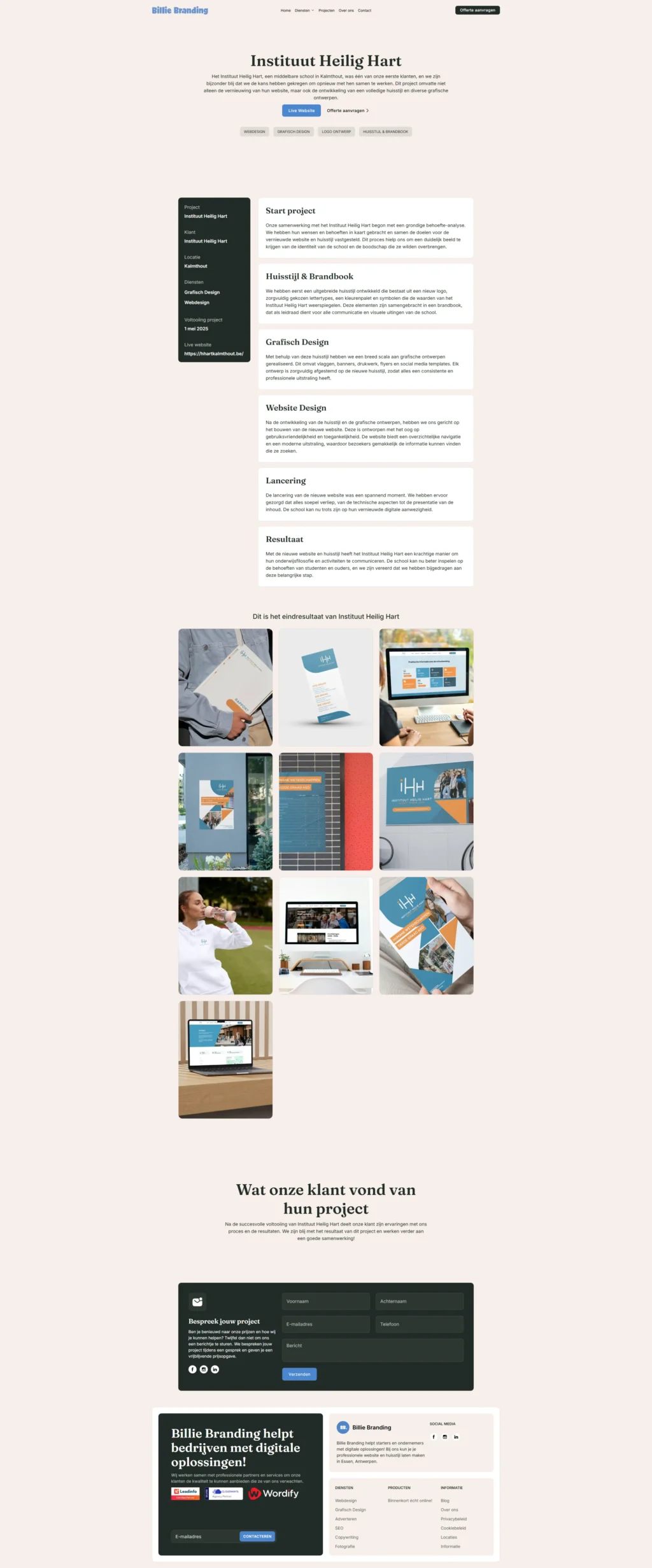
When we were approached to develop the Zehentbauer platform, the challenge wasn’t just aesthetic, it was a matter of technical feasibility. This project required a level of engineering web design …
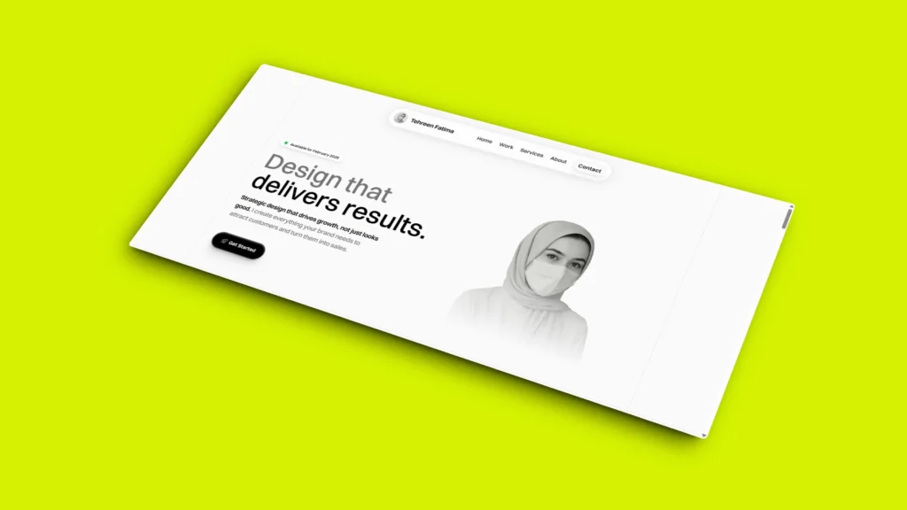
For Tehreen’s website, the goal was a “Future-Modern” aesthetic. Our team functioned as a boutique ux design company, developing a bespoke platform that showcases high-end ui ux design services. Even …
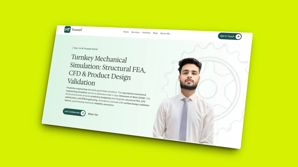
Our personal portfolio shouldn’t just be a digital CV; it should be a live demonstration of high-stakes engineering. For touseef.xyz, our team didn’t just build a website; we developed a …
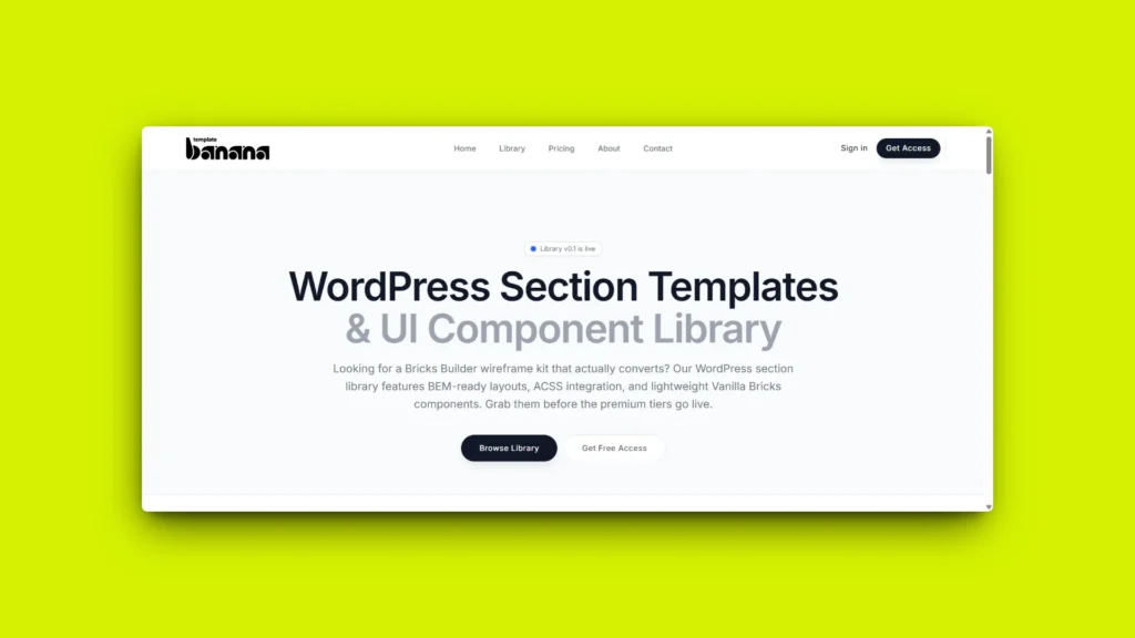
TemplateBanana is Sityn’s gift to the web design agency world. We developed this platform as a central hub for affordable web design resources that don’t compromise on quality. By functioning …
You’ve probably got the same questions our last ten clients had, and that’s cool. We answered them below to save you time. Scroll through, get a feel. And when you’re ready? Slide into our inbox, we’re quick with it.
Depends on the package. One-pagers can ship in a week or two. Full-stack builds usually take 3–5 weeks. We don’t drag.
No problem. We can tweak any package or build something custom. Hit us up, we keep it flexible, not boxed in.
100% custom. No pre-made drag-and-drop junk here. Every build starts from scratch and fits your brand, your flow, your content.
Yep. Start small, scale when you’re ready, no need to overcommit up front.
Just your core info, your offer, any branding assets, and the basics about your audience. We’ll walk you through the rest.
None. What you see in the package is what you get. If anything outside scope comes up, we’ll talk first, no sneak charges.
If we’ve already started, we’ll bill for the work done so far and release what’s ready. Fair and clean.
Yeah, but we’ll re-scope it so timelines and pricing stay transparent.
Yep, ACF, Bricks Builder, WordPress CMS, you name it. We build smart so you can edit content without calling us every time.
Nah, we split it. Usually 50/50 or milestone-based. Flexible if needed.
It comes down to your goals. Launching fast? Start light. Scaling big? Go full-stack. Still not sure? Drop us a line and we’ll guide you in 2 minutes flat.